My "front Room Fruity"
Started by Wolfie_MFME, Sep 22 2010 04:41 PM
45 replies to this topic
#1

Posted 22 September 2010 - 04:41 PM
Well, as promised I start a new thread,
1600 on a dual display looks great,..... except there is no real standardisation so unfortunately the picky ones complain that it splits a couple of graphics across the border. Ie, load up "I'm a Celeb" , (Must point out that Ploggy and Baz have achieved magic with this layout. Perfect in all respects)
Imagine a split at the very top of the first feature board. now see how it splits the graphics either side?
I'm going to address this one day as it really really looks and plays nice on 2 screens aside from this.
It would be perfectly ok, but with each to their own layout methodology, you can get the screen set just right to play, then load up the next rom, ie LOTR and slap. It's all out of whack again, you split the feature board and requires some poggling to straighten up the image. Lots of silly faffing for little showoffability.
(No, I'm not a moron and I can Jscript it to auto-adjust on a rom - rom basis, so it can be achieved)
So. For now a 22" TFT is the way to go, with full 1600.
I'll take a couple of pics of my cab and upload either tonight or tomorrow.
What I could really use is Mr Ploggy to re-design the Indy 1600 as good as the 1280 because unfortunately, re: the JPM ver...it's not right. The reels look odd, it doesn't really look good at all. Really sorry Duplu. If it could be run in any other one except the JPM emu it could be as good as the smaller one I'm sure. This is the clincher, Indy is the most wanted cab I have. I actually have (a mate with) the real cab too. (Pennybox)
Also I'm crying out for Addams to be redone in 1600 too, as this is no 2.
Cash Bazaar looks nice. (as does around the world and Big Breakfast, LOTR, IAC, and some others)
Here I'll show you the pics and it will explain it better.
Ploggy, I'm happy to donate research cash to you if you are able to do 1600 in the same quality as your others.
But all this aside, am I really the first person to build a working cab for this emu?
It's going to be a killer at parties.
- Johnnyafc likes this
#3

Posted 22 September 2010 - 05:35 PM
Just doing some tweaking, pics definately will be up tonight.
#4

Posted 22 September 2010 - 05:52 PM
OMFG PICS NOW!!!!!!!!!!!!!!!!!!!!!!!!!!!!!!!!!!!!!!!!! 
#6

Posted 22 September 2010 - 06:28 PM
LOL!
I reckon it will be ready, enamel dry and fired up before 22:00 BST.
It's real, Fear it....... lol.
I reckon it will be ready, enamel dry and fired up before 22:00 BST.
It's real, Fear it....... lol.
#7

Posted 22 September 2010 - 08:58 PM
Boo, would have been if the stupid broadband was reliable...... Sorting pics now.
Attached Files
#8

Posted 22 September 2010 - 10:18 PM
I apologise for the delays, Been fighting trying to maintain a broadband link and just got (partially) back on. So I blew my timescale.
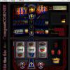
Anyhow, pics unflattering as they are, I introduce "Wolfie's Front room Fruity, Beta .02"
The first was made from cardboard, this is wood with enamel coating and a dark formica laminate texture wrap done with photopaper.
The Buttons are genuine Happs controls, the ASCII converter is an IPAC.
The rest is an old PC 2800 AMD with a Radeon 9800 pro. 22" Samsung screen.
Coin mech is just a 1 player cherry button. (Got ideas for a simple coin mech and paying mech using a cam, for moneybox purposes)
I have clear lexicon for the screen protector, (Not fitted as I built this cabinet with a Gerber and cannot cut it properly)
Total project time = approx 8 hours.
Cost = 1 x Gerber which snapped 1/2 way through, some glue, some bits from Tesco / Homebase and my attic.
+ monitor, which is about £120
also some beers and loud music, namely Duck Sauce - Barbara Streisand, Swedish House Mafia and Riva Starr.
As you can see I cannot connect it to the internet for Spotify because we are severely let down with our internet service here.
But trust me it works brilliantly with Spotify, and web surfing as you can physically see double the range of a standard monitor.
I am going to move on with this and get a true replica cab made by a professional.
Been very busy the last couple of weeks moving house, Now I have a 200 ft workshop WOO!!!!!!!
I likes me IT.
PS. I claim baggsy to being the first to make one!
Well, I'll post when I have something interesting to show y'all.
Attached Files
#9

Posted 22 September 2010 - 11:25 PM
nice. cool convert.
Former Fruit Machine Engineer.<br /><br /> 1988-2004.
#10
 Guest_robinhood75_*
Posted 22 September 2010 - 11:55 PM
very nice, good work on the case 
#11

Posted 23 September 2010 - 07:19 AM
This is excellent mate, looks pretty neat. I think a layout with a totally black background would make this look even better.
J
J
// stumblin' in the neon groves
#13

Posted 23 September 2010 - 10:30 AM
Very impessive, i would love one of those for my front room. 
#14

Posted 23 September 2010 - 11:17 AM
Hats off to yer! ha ha quality!!
#15

Posted 23 September 2010 - 03:48 PM
Thanks for the nice comments,
It's actually useful having the graphical buttons at the bottom because they flash etc, unlike the cherry buttons, but it is really easy to differentiate which button should be what, kinda comes as second nature when playing strangely.
I lifted the 4th button deliberately to eliminate confusion on 3 reel games, but as soon as I'd cut the hole I saw it just looked like I had cocked up the measurement. It was unnecessary in retrospect and just bugs me.
The case has a couple of rough edges, but with a little TLC can be made to look nice with the Lexicon fitted I think.
I totally agree with the black background idea, would make it very pretty.
Also would be so nice if I could shrink or hide the huge tool banner along the top, I understand why these run windowed, but is there need for such a huge space killer at the top? It looks loads better if I bezel it off, but need the space back when using ie: Spotify and stuff.
Cheers all, mucho appreciate the feedback!
The picture quality of those uploads is very poor and compressed and does it no justice at all, the clarity of the screen is perfect (Believe it or not)
Iphone camera.
Oh yeah, while I remember..... If you want to play these ROMS on your Iphone, you can via the RDP app. run it as normal on a PC in the house and RDP into it via the phone then zoom to fit. Ta Da! touchscreen works on the buttons and everything. it looks pretty cool and plays too.
Perfect miniature, no need for a tailored emu app! its already done.
#16

Posted 23 September 2010 - 07:48 PM
I got to be honest here and say it's hideous (as it is ATM). Hopefully it's taken in a constructive way.
Am I the only one that think this looks terrible? I just don't see the point.
If it's emulated perfectly on a decent DX why wold you want to play it on that ugly thing?
I can see the point of MAME cabinets (nice ones) and could see where this might be good if it was done in a cabinet that if more or less exactly like a fruit machine cabinet is - But this is nothing like it and looks horrendous (and the buttons are in the DX - So why have this?)!!!
"Stay Fit, Keep Sharp, Make Good Decisions"
#17

Posted 23 September 2010 - 08:20 PM
Nice concept, but I thought this project was to be touchscreen originally?.........that would be nice though open to the minority.
I can't see (as was said) its honestly no different to a MAME set-up...but without the origins of how it SHOULD look.
On a training course at work a year-or-so ago I had to show a hobby, I created an Emu and showed it on an overhead basically lifesized....I can't see where this is going or what's achieved for FME?
#18

Posted 23 September 2010 - 10:18 PM
'£6 In Tokens', on 23 Sept 2010 - 8:13 PM, said:
Am I the only one that think this looks terrible? I just don't see the point.
'ady', on 23 Sept 2010 - 8:45 PM, said:
I can't see where this is going or what's achieved for FME?
The point is, the chap wanted to make something and share it with the scene what he had done. It's not going actually achieve anything for FME apart from the completion of Wolfie's personal goal.
Personally I think it's a really novel and neat idea and looks bloody brilliant for the goals he's set. You're not going to make it perfect, but how do you make it perfect when a fruit machine has so many variations of buttons etc across layouts?
Great work Wolfie and thank you for sharing.
- Johnnyafc likes this
#20

Posted 24 September 2010 - 01:54 PM
I think it's marvellous when a new member joins the scene and has a project or something new to share with everyone. This guy has formed a plan for making his own cabinet to run layouts of emulated fruit machines, and has achieved what they set out to do, and provided details of the parts used so anyone else interested might feel inclined to have a go themselves. I for one would rather play layouts on this using real tactile buttons and a decent image resolution than click a button image on my laptop screen with a mouse.
Wolfie - many thanks for sharing your project with us, and thanks for the pictures. And it's always good to see new people joining the forum with something to offer.

Wolfie - many thanks for sharing your project with us, and thanks for the pictures. And it's always good to see new people joining the forum with something to offer.
Watch out! There's a SIG thief about...
0 user(s) are reading this topic
0 members, 0 guests, 0 anonymous users


