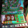
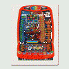
Having had a quick play on the layout (working on an insane RAM file, wanting to see if I can get it to pay £500 in the space of about £20 of credits), and a couple of things spring to mind
 [edit] - just realised this is your first DX, so congratulations on that! I don't intend the below to be a 'bashing', just some pointers for future work!
1) There isn't really any need for the bottom of the machine cabinet to be visible on a 1024 layout, unless the base art is really bad, and I don't feel it is in this case.
2) The bottom of the machine (which isn't needed) is flashing in attract mode - which is strange, I'm sure it would normally be lit by fluorescent tube - if anything it would be better permanently on.
3) Most of the lamps haven't been placed correctly. If you open the layout in MFME, then drag the window bigger and smaller horizontally, you see the lamps jumping all over the place.
To solve :
1) - on '1024' layouts space really is at a premium. I'd suggest giving more space to 'useful' parts of the machine, to increase reel size / lamp size.
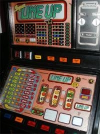
2) Think about the real machine, and try to be fairly accurate. It's OK to put your own twist on things, but a flashing belly glass in this case just isn't needed

3) Before you release the layout, check things like lamp positions by dragging the window bigger and smaller as mentioned above. I normally do it after placing each lamp, because a lamp that is out of place should 'jump' about. Basically keep moving it, or adjust the X and Y coordinates of it in edit mode, until it stops jumping.
Apart from those little things, it does exactly what it should do, and thanks for releasing it - I just feel it's best you learn these things early

Edited by Bencrest, 12 October 2012 - 12:50 PM.


