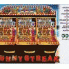
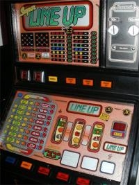
Pretty disgraceful behaviour, but in some ways it is kinda funny... I mean it's such a crap imitation... really REALLY badly made, I very nearly wet myself laughing when I dragged the side of the window to see if the lamps were jumping

Trust me Ross, no one will think any less of you as a designer just because this idiot has completely butchered a layout of yours. Could be worse... he could have put 'THANKS TO ROSS FOR HIS HELP WITH ART' or something similar

I guess he has several options now, apologise for making a hash of it, and try something else (ideally from scratch), or to tell everyone to eff-off

On a similar note - I do think we need to have a reality check on the quality of layouts on here. Far too often I've (as a lurker) seen a sub-standard layout given ridiculous praise. In this instance, even posting 'thanks!' or similar is too much. People need to be willing to give (and receive) criticism, otherwise we are diluting the quality of work associated to the site. My layouts are crap in comparison to some work, but conversely some of the work I did in 2005 is better than what is being produced today, and that's a backward step.
In this instance, I can't help but feel that the layout should be removed, and someone else have a shot at a 1024 from scratch. There's nothing wrong with asking a designer for their permission to use lamp numbers, reel positions, e.t.c. (because it can save a lot of time!), but to just resize the artwork is ridiculous.
I honestly reckon it took MORE time to resize the lamps and make this appalling layout, than it would've done to resize the base art (WITH PERMISSION) and lamp from scratch. Again, if you don't get permission, get the flyer and clean it yourself, or ask for help - I'm sure people with Photoshop or similar experience will clean a flyer if required

Edited by Bencrest, 24 September 2012 - 08:22 PM.


