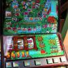
Cheers for this, quite a nice little machine! Regarding the clarity, I've not looked at your source but I can only assume that's pretty out of focus too, I'd say you've done the best you could without redrawing it. I've had a quick bash on Ploggy's 1600DX and even at that high a resolution, it's softly focused, and quite hard to make out most of the text on it, so it's not your fault.
Quite liking the side art, which is odd as I normally don't like side-art. I like brick backgrounds, although there's a bit of JPEG compression evident, it blends in fine when playing and you don't notice it.
Teeny tiny little thing - I'd probably have trimmed a bit of the free space above the cabinet, which would have freed up a bit more room to make the buttons fully visible at a normal 1366x768 resolution without having to drag your Windows bar to the side, or have it set to hidden. Not really a big issue, and personally I play with the keyboard anyway.
Oh, and the reels - if you do 'set reel background' on them, you get white edging, the reason for this is that on the 'background' art, the reel windows have been filled in and some anti-aliasing has been applied by whichever tool you used. Best advice I can give is to just load the base art into MS Paint, pick the perfectly square paintbrush (literally just a box, no soft edges or anything), do any bits you want to be transparent in bright green or red, something obvious, and then save out. Perfectly happy to demonstrate or send an example if required. You've clearly had a good crack at it though so cheers for that 
In any case, it's a nice machine and a nice layout, just a shame that a better source wasn't available just to make things a little sharper, not your fault though and it's good fun to play - thanks for the release 
Edited by Bencrest, 21 December 2012 - 03:11 PM.


