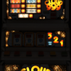
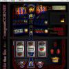
Yeah, looks OK here. Looking specifically at positions 3, 6 and 8 on the red trail, the centres of your 'lamps' (not sure which tool you use) - the most brightly lit parts are off centre. Having said that I don't have the actual machine to look at, and as long as there is good contrast between on and off I guess it's not an issue. It may not be accurate, but most layout designers try and keep the brightest parts of their lamps in a near perfect line, or curve, because it's more pleasing to the eye (and it is how you would expect the actual machine to be lamped, even if it's not the case).
The buttons are a bit hard to read (well, impossible to read) but that may be down to JPEG compression on your screenshot, or the quality of the flyer you had. Luckily the button position makes it obvious what they will do, so it's not a major issue. Does look like the source art is pretty blurry though. I suppose the proof of the pudding will be in the eating? 
Edited by Bencrest, 10 April 2013 - 06:39 AM.


