Jump to content


Photo

{MPU5}Sting King Rich £25 Dx


  • Please log in to reply
22 replies to this topic

#1 brucegeorge

brucegeorge

    Layout Disasters

  • Layout Creator
  • PipPipPipPip
  • 1710 posts

Posted 11 January 2017 - 11:06 PM

File Name: Sting King Rich £25 Dx

File Submitter: brucegeorge

File Submitted: 11 Jan 2017

File Category: MPU5


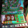
This is Sting King Rich by Red Gaming set on £25 Jackpot 30p Play
 
Ok first I need to explain a few things I'm having a huge problem with the Green and Red lamps on this machine you will see they jump about and I don't have a clue why I think it maybe down to the size of the layout because I have re-done them 3 times now and they just do the same if anyone can explain what is going on I would be happy to sort the problem out and re-upload it
 
I had some nice feedback about the Jackpot Genie layout being a large size so I did the same with this but I think this we have to be the last one I do at this size as its not fair to the site and I have a feeling it plays about with the lamping aswell
 
So from now on I'm going to make the layouts normal size
 
I would like to thank
 
Samson81 for the Flyer
Spa for the Roms
TommyC for advice
Wizard for MFME5.1
 
Enjoy :)


Click here to download this file


#2 andy-1

andy-1

    Layout Creator

  • Layout Creator
  • PipPipPipPip
  • 1987 posts

Posted 11 January 2017 - 11:11 PM

Thank You


#3 vectra666

vectra666

    No1. Lurker

  • Layout Creator
  • PipPipPipPipPip
  • 9041 posts

Donator

Posted 11 January 2017 - 11:51 PM

Firstly thanks for the layout.
So far not downloaded so not completely sure about the "jumping" lamps but I remember a layout I did, jokers wild the lamps did what you say the reason was the artworks were a pixel out from each other so I'd check the size of your arts just in case, as even one number out will make em jump. As for big layouts end of the day like Samson with space invaders etc its upto you how big you make em but personally I make mine around 1200h x 1600w plenty big enough for my tastes, just a question whilst we're on about size? What would be the largest size be required without the need for shrinkage as in what's the biggest computer screen size to layout size as maybe we should be working around that areas limits?
The more I do today, The less I do tomorrow.
Fme is alive and screaming into the 21st century!
Enjoy FME and Happy Gaming!!!!

#4 ritdav

ritdav

    Junior Member

  • Regulars
  • 389 posts

Posted 12 January 2017 - 12:27 AM

Thanks for the layout


Edited by ritdav, 12 January 2017 - 12:33 AM.


#5 chasnbons

chasnbons

    Junior Member

  • Regulars
  • 1282 posts

Posted 12 January 2017 - 07:19 AM

TY :)


#6 wearecity

wearecity

    MFME v whatever the next version number user.

  • Regulars
  • 1672 posts

Posted 12 January 2017 - 08:29 AM

I think this layout looks superb, perhaps it very subtle, but I can't really see anything wrong with it.


Loving all the Red Gaming stuff, at the moment not playing a lot of anything, because of being addicted to get older stuff working, but definitely one, I'll be spending time with on my next long train journey.


#7 Geddy

Geddy

    Banned

  • Banned
  • 3433 posts

Donator

Posted 12 January 2017 - 09:52 AM

Many thanks, top DX...


#8 letmein

letmein

    Advanced Member

  • Regulars
  • 718 posts

Posted 12 January 2017 - 09:52 AM

Thanks Bruce.


M


#9 ricardo de ponsa

ricardo de ponsa

    Man Of Science

  • Regulars
  • 1110 posts

Posted 12 January 2017 - 04:17 PM

Thank You Bruce.


Don't come round and steal my Cheerios !!!!


#10 Bandits

Bandits

    Senior Member

  • Regulars
  • 1124 posts

Posted 12 January 2017 - 06:12 PM

Thanks Bruce.


:) Hold Yer Plums Or Go For The Melons :)


#11 No1Stoney

No1Stoney

    Senior Member

  • Layout Creator
  • PipPipPip
  • 815 posts

Posted 12 January 2017 - 07:37 PM

What am I missing? I can't see anything wrong with this layout at all? The green/red lamps seem fine when I play it?


That aside, this DX is superb mate, well done. Very vibrant.  Like it a lot. Thanks for this


#12 brucegeorge

brucegeorge

    Layout Disasters

  • Layout Creator
  • PipPipPipPip
  • 1710 posts

Posted 12 January 2017 - 07:53 PM

It's hard to explain but if you watch the machine it attract mode you will see the Red lamps move I don't understand why I have used the same base art for all three lamps its just the Red ones that move they kinda stretch in a weird way it doesn't matter when playing the machine it just bugs me it ain't right lol


#13 flying_giraffe

flying_giraffe

    Junior Member

  • Regulars
  • 164 posts

Posted 12 January 2017 - 07:56 PM

lovely dx mate, thanks


#14 Dualton

Dualton

    Newbie

  • New Members
  • 45 posts

Posted 12 January 2017 - 08:06 PM

Superb layout this one, thanks


#15 Wizard

Wizard

    MFME Creator

  • Regulars
  • 719 posts

Posted 12 January 2017 - 08:41 PM

It's hard to explain but if you watch the machine it attract mode you will see the Red lamps move I don't understand why I have used the same base art for all three lamps its just the Red ones that move they kinda stretch in a weird way it doesn't matter when playing the machine it just bugs me it ain't right lol


I can't see anything wrong either tbh. as the Red and Green images are the same size, they will be drawn exactly the same. Do you wear glasses by any chance? I have noticed that different colours are sometimes distorted due to their wavelengths and can result in the impression they are actually moving! Or are in slightly different positions.


Edited by Wizard, 12 January 2017 - 08:41 PM.

Warning: This post is mostly my own opinions and may contain irony, if you are obsessed with PAST history you may want to ignore it.


#16 brucegeorge

brucegeorge

    Layout Disasters

  • Layout Creator
  • PipPipPipPip
  • 1710 posts

Posted 12 January 2017 - 08:49 PM

Watch Find The Money lamp in attract mode and tell me you can see what i see PLEASEEEEEE lol


Its like the lamp goes a step to the left like a lamp behind it is messing with it I don't know how to explain it lol


Edited by brucegeorge, 12 January 2017 - 08:53 PM.


#17 No1Stoney

No1Stoney

    Senior Member

  • Layout Creator
  • PipPipPip
  • 815 posts

Posted 12 January 2017 - 09:11 PM

I'm pretty sure there is nothing wrong with the lamp when I run it on my PC, . I;ve been staring at it for a few mins now and my head hurts lol


#18 Wizard

Wizard

    MFME Creator

  • Regulars
  • 719 posts

Posted 12 January 2017 - 09:20 PM

What resolution are you running it at ?


Warning: This post is mostly my own opinions and may contain irony, if you are obsessed with PAST history you may want to ignore it.


#19 No1Stoney

No1Stoney

    Senior Member

  • Layout Creator
  • PipPipPip
  • 815 posts

Posted 12 January 2017 - 09:34 PM

Im running it at 2560x1440. Just tried scaling the layout down and I think I can see the problem being referred to, but I think its minor. Just looks like the text jumps slightly to the left.right when changing from red to green and vice versa.


Anyway brucegeorge, I wouldnt worry about it to be honest, its very minor and barely noticeable. You only notice it because you have been starring at it all day lol


#20 vectra666

vectra666

    No1. Lurker

  • Layout Creator
  • PipPipPipPipPip
  • 9041 posts

Donator

Posted 12 January 2017 - 10:03 PM

Watch Find The Money lamp in attract mode and tell me you can see what i see PLEASEEEEEE lol


Its like the lamp goes a step to the left like a lamp behind it is messing with it I don't know how to explain it lol

yes they do go to the left very very slightly hardly noticeable i think whats happened here is the green lamps you've light fully where as the red lamps you've brought the lamp/light in slightly causing this slight move, take a look at my money to burn layout the trail lamps i made em too dark so they appear to move due to bringing in the lamp to much via ommi lamp  got to say the red/green lamps on your layout are true to the real thing sometimes the red's look too red on some emulations

Attached Files


The more I do today, The less I do tomorrow.
Fme is alive and screaming into the 21st century!
Enjoy FME and Happy Gaming!!!!


1 user(s) are reading this topic

0 members, 1 guests, 0 anonymous users