Jump to content


Photo
* * * * * 1 votes

Mario Kart 64 layout


  • Please log in to reply
26 replies to this topic

#1 freebucksguy

freebucksguy

    Newbie

  • New Members
  • 14 posts

Posted 30 July 2018 - 12:19 PM

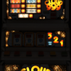
I am working on my first layout and the obvious choice for me was Mario Kart 64. the reason being I own the actual machine and only a classic exists on here right now. My graphics and photography skills are poor and then my machine started having some faults (most likely the PSU) so it is taking a while to complete. I have the bottom board complete and part of the top board, I will post some pictures or a video of how it currently looks later in this thread and would greatly appreciate any suggestions on how to improve what I have so far

Attached Files


Edited by freebucksguy, 30 July 2018 - 12:20 PM.


#2 wearecity

wearecity

    MFME v whatever the next version number user.

  • Regulars
  • 1672 posts

Posted 30 July 2018 - 02:44 PM

Great to see someone else having a go at creating.

Good luck and look forward to seeing the finished layout.

I'm sure some of the experienced DX'Rs will offer help and advice.

Ross has some videos that may help, they have greatly helped me with my first DX, which is still in wip.

#3 vectra666

vectra666

    No1. Lurker

  • Layout Creator
  • PipPipPipPipPip
  • 9041 posts

Donator

Posted 30 July 2018 - 03:35 PM

Looks ok from what I can see and well done for giving it a go.
You may want to darken down you image as it'll make the lamps stand out better.
The more I do today, The less I do tomorrow.
Fme is alive and screaming into the 21st century!
Enjoy FME and Happy Gaming!!!!

#4 TommyC

TommyC

    Layout Designer

  • Layout Creator
  • PipPipPipPipPip
  • 2832 posts

Posted 30 July 2018 - 05:05 PM

Good luck with this,just a little tip,i'd grab some much clearer images of your top glass,this image will be a killer to lamp as the colours on these epoch machines were horrible,i struggled with homers meltdown.


Hold the bells mate.

#5 freebucksguy

freebucksguy

    Newbie

  • New Members
  • 14 posts

Posted 30 July 2018 - 05:08 PM

I am actually taking shots of each image as I attempt to do them when my darn machine bothers to load up, I think I need to strip the PSU down and check if it can be fixed before I continue as its been a nightmare trying to get the top board nudge numbers done

Good luck with this,just a little tip,i'd grab some much clearer images of your top glass,this image will be a killer to lamp as the colours on these epoch machines were horrible,i struggled with homers meltdown.


#6 freebucksguy

freebucksguy

    Newbie

  • New Members
  • 14 posts

Posted 07 August 2018 - 06:42 PM

Some updated images coming soon, I restarted and have darkened the machine to make lamps stand out more, As my machine is having some unknown error and stopping me getting some lamp pictures I am digitally reworking some of the art myself (painstakingly slowly as I am not great at it) but the machine is starting to look playable, well the lamps I have done so far


#7 vectra666

vectra666

    No1. Lurker

  • Layout Creator
  • PipPipPipPipPip
  • 9041 posts

Donator

Posted 07 August 2018 - 07:05 PM

look forward to the images


The more I do today, The less I do tomorrow.
Fme is alive and screaming into the 21st century!
Enjoy FME and Happy Gaming!!!!

#8 TommyC

TommyC

    Layout Designer

  • Layout Creator
  • PipPipPipPipPip
  • 2832 posts

Posted 07 August 2018 - 07:19 PM

Good luck upload your screen shot progress as you go along.


Hold the bells mate.

#9 freebucksguy

freebucksguy

    Newbie

  • New Members
  • 14 posts

Posted 07 August 2018 - 07:50 PM

http://107.150.36.26/mk64-video.mkv quick video of current status, the board at the top is far from finished, I plan to do each image separately and try to get them looking as close to the actual ones as I can. I will probably fail miserably but it is fun trying all the same :)


As usual any criticisms are appreciated and more so any tips on how to make my mistakes better are obviously appreciated even more


#10 freebucksguy

freebucksguy

    Newbie

  • New Members
  • 14 posts

Posted 13 August 2018 - 10:51 PM

Sorry this is taking so long, I am currently improving my image editing skills to try and raise the quality to be at least playable. I know it wont be great being my first and lack of skills in this area but I want to make it playable. I am reworking most images and colors to more accurately match the machine itself


#11 mort

mort

    Layout Designer

  • Layout Creator
  • Pip
  • 354 posts

Posted 13 August 2018 - 11:01 PM

Take your time, no rush. Good to see a new designer getting started.


#12 freebucksguy

freebucksguy

    Newbie

  • New Members
  • 14 posts

Posted 18 August 2018 - 06:26 PM

How does this top reel band look? I did not like the colors and the number 1 from the classic (not the same font as the machine) so I have redone the 

colors and tried to recreate the number 1 closer to the actual style of the machine.


 band3c.jpg


#13 richy1976

richy1976

    The furniture

  • Regulars
  • 2601 posts

Donator

Posted 18 August 2018 - 10:33 PM

Nothing wrong with that mate.
Maybe bring the 10 11 12 left a touch.

#14 freebucksguy

freebucksguy

    Newbie

  • New Members
  • 14 posts

Posted 18 August 2018 - 10:39 PM

I see what you mean, corrected that now thanks


Nothing wrong with that mate.
Maybe bring the 10 11 12 left a touch.


#15 angelus118

angelus118

    Member

  • Regulars
  • 168 posts

Posted 19 August 2018 - 02:16 PM

Wishing you luck with this! Cant wait to see the finished layout.......


Man I gotta headache!!!

#16 innfection

innfection

    Requestor/Bug Finder/Resourcer/

  • Regulars
  • 761 posts

Posted 19 August 2018 - 02:20 PM

Looks good so far 😎

Resourcer/Bug Finder 


#17 innfection

innfection

    Requestor/Bug Finder/Resourcer/

  • Regulars
  • 761 posts

Posted 20 August 2018 - 01:40 PM

Any eta on release?

Resourcer/Bug Finder 


#18 freebucksguy

freebucksguy

    Newbie

  • New Members
  • 14 posts

Posted 20 August 2018 - 01:55 PM

It is to a playable level, but it is still too low quality for me to do it as a release on here. I will upload it to one of my own servers shortly and leave the link in here so people can try it and give me any advice on how to improve it though

Any eta on release?


#19 freebucksguy

freebucksguy

    Newbie

  • New Members
  • 14 posts

Posted 20 August 2018 - 02:03 PM

Here is the current low quality but playable version, Much more needs doing with it but it is taking me a while http://107.150.36.26...rio kart 64.zip


Forgot to say it runs in mfme 6.0


#20 innfection

innfection

    Requestor/Bug Finder/Resourcer/

  • Regulars
  • 761 posts

Posted 20 August 2018 - 02:46 PM

Ah ok

Resourcer/Bug Finder 


1 user(s) are reading this topic

0 members, 1 guests, 0 anonymous users