thank you for this and thankyou for trying,but....
here's the down side of this post.
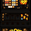
you really need to be trying harder to get a better looking layout than this, members will download this just because its a dond and not for its quality
As said before you need to get better artwork to start with if you want to succeed in this hobby.
Don't try to run before you can walk!!!
yes i've said before it took myself a lot of layouts and time and a lot of criticism to get where i am today in terms of quality and i don't even think i'm half as good as the greats of past and present.
Now onto your layout,
apart from the quality of the artwork used
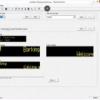
the base buttons when lit are unrecognizable far to bright.
the lamps are not masked properly, again this took me a while to correct.
dond box in the centre is missing
features "stir crazy & flash the cash" lamps missing also including the red coloured lamps for the features
as is the note inputs.
seven segs need enlarging and recolouring
reel windows need doing correctly as in windows blanking out
also a lot of other bits wrong in this layout
Find something simple with decent artwork like a lo tech with few lamps to get a feel of the tools within photoshop and mfme's tools, even if its something already released, it doesn't matter as long as it looks ok, which in my eyes this doesn't, sorry to say.
As said before "if" you require help please,please don't be afraid ask for it. you can only improve with guidance, if not and you continue to produce work of this quality you'll only make a rod for your own back and get backlash.
Edited by vectra666, 19 May 2019 - 07:16 PM.
The more I do today, The less I do tomorrow.
Fme is alive and screaming into the 21st century!
Enjoy FME and Happy Gaming!!!!


