Jump to content


Photo
* * * * * 1 votes

Luckys 2's MK1 SRU JPM


  • Please log in to reply
27 replies to this topic

#1 frig

frig

    Member

  • Regulars
  • 332 posts

Posted 25 June 2019 - 03:32 PM

Hi Guys. 

After rummaging through loads of roms posted on MPU MECCA

I finally found the game I was looking for.... 1980's LUCKY 2's on 10p play.


Unfortunately I could only find 1 youtube video of this (Thanks to Chris217 https://youtu.be/9IorbdeS6dk)

and zero photographs anywhere, but being quite similar to my last layout, I was able to save some time. 

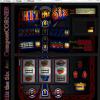
After a full day of addictive clicking, I have managed to get the top glass finished, and have finished redrawing my bottom glass.


Coming soon:)

Attached File  lucky 2s.bmp   24.02MB   42 downloads


#2 richy1976

richy1976

    The furniture

  • Regulars
  • 2601 posts

Donator

Posted 25 June 2019 - 03:40 PM

Looks nice frig.

Wouldnt you think about skewing it into a cabinet?.


#3 vectra666

vectra666

    No1. Lurker

  • Layout Creator
  • PipPipPipPipPip
  • 9041 posts

Donator

Posted 25 June 2019 - 08:05 PM

not my era but looks the biz! did you draw all that in yourself from scratch if so you've certainly a knack for it, would you consider doing something a little later as your next, i'd love to see what you can do?


The more I do today, The less I do tomorrow.
Fme is alive and screaming into the 21st century!
Enjoy FME and Happy Gaming!!!!

#4 superbaron

superbaron

    superbaron

  • Regulars
  • 284 posts

Posted 25 June 2019 - 08:27 PM

Thank you it looks fantastic.


#5 frig

frig

    Member

  • Regulars
  • 332 posts

Posted 26 June 2019 - 03:59 AM

Looks nice frig.

Wouldnt you think about skewing it into a cabinet?.

I thought about it, but decided to keep it flat. When you play a machine in the wild, you look down on to the reel glass anyway so it would look flat anyway. I also think that some time in the future we may be able to shape the layout to suit, either with a flexible screen, or dual monitor set up?


#6 frig

frig

    Member

  • Regulars
  • 332 posts

Posted 26 June 2019 - 04:20 AM

not my era but looks the biz! did you draw all that in yourself from scratch if so you've certainly a knack for it, would you consider doing something a little later as your next, i'd love to see what you can do?


Apart from the fruit symbols and the small JPM logo on the top glass, everything is from scratch. Fortunately I was able to reuse about 70% of the bottom glass from my previous layout - which was from scratch also. Unfortunately I am not an artist, so I can only manipulate shapes, text, colour ect, so these old style games are not that difficult for someone with patience.


#7 barcrest junky

barcrest junky

    Senior Member

  • Moderators
  • 843 posts

Posted 26 June 2019 - 06:06 AM

Wow, played this last month. Fantastic game. Looking forward to the layout very much.

#8 DAD

DAD

    Advanced Member

  • Moderators
  • 542 posts

Posted 26 June 2019 - 07:28 AM

I thought about it, but decided to keep it flat. When you play a machine in the wild, you look down on to the reel glass anyway so it would look flat anyway. I also think that some time in the future we may be able to shape the layout to suit, either with a flexible screen, or dual monitor set up?


It would look great in a cab. 


I made my own version of Nudge Shuffle from the superb artwork you did using a cab Ploggy made a while back in one of his releases. 


Needless to say this won't be released for a long time, if at all.  I'd need permission from quite a few people ;)  Just though i'd show you what it looked like.

Attached Files


#9 frig

frig

    Member

  • Regulars
  • 332 posts

Posted 26 June 2019 - 08:42 AM


It would look great in a cab. 


I made my own version of Nudge Shuffle from the superb artwork you did using a cab Ploggy made a while back in one of his releases. 


Needless to say this won't be released for a long time, if at all.  I'd need permission from quite a few people ;)  Just though i'd show you what it looked like.

It looks really nice indeed. You would definitely have my permission to use any of my artwork. If ploggy lets you use his cabinet, then I think you should release it as a "cabinet version" along with Lucky 2s which is now ready for doing lamp slices.


#10 frig

frig

    Member

  • Regulars
  • 332 posts

Posted 26 June 2019 - 09:03 AM

If someone can send me a really high quality image of an SRU cabinet, before I start lamping, then I will stick it in a cabinet. I have looked through my own pics, and I only have half a cabinet picture.


#11 barcrest junky

barcrest junky

    Senior Member

  • Moderators
  • 843 posts

Posted 26 June 2019 - 10:20 AM

If someone can send me a really high quality image of an SRU cabinet, before I start lamping, then I will stick it in a cabinet. I have looked through my own pics, and I only have half a cabinet picture.


Ask Chris over at the Mecca. It's his machine I was playing and he will take photos for you.

#12 TommyC

TommyC

    Layout Designer

  • Layout Creator
  • PipPipPipPipPip
  • 2832 posts

Posted 26 June 2019 - 01:12 PM

Looks the dogs do dahs,when you upload your wip image if you upload it as a png,it will show automatically without having to download it and it will be alot smaller in size too.


Hold the bells mate.

#13 frig

frig

    Member

  • Regulars
  • 332 posts

Posted 26 June 2019 - 01:55 PM

Looks the dogs do dahs,when you upload your wip image if you upload it as a png,it will show automatically without having to download it and it will be alot smaller in size too.


Ah.. I wondered why there was no thumbnail.


So here is the 99% finished layout (in non Bitmap format) prior to chopping up for lamp therapy, and awaiting any comments on colour, errors or spelling mistakes.

Attached File  Lucky 2s - wip_5.jpg   349.81KB   2 downloads


#14 cashbox1

cashbox1

    The furniture

  • Layout Creator
  • PipPipPipPipPip
  • 2553 posts

Posted 26 June 2019 - 05:04 PM

it would look even more mint if you skewed the image and stuck it in a decent cab :)


Einstein`s theory of FME 90 downloads = 3 thanks


#15 DAD

DAD

    Advanced Member

  • Moderators
  • 542 posts

Posted 26 June 2019 - 06:05 PM

it would look even more mint if you skewed the image and stuck it in a decent cab :)

Read up ^^^^^^


#16 vectra666

vectra666

    No1. Lurker

  • Layout Creator
  • PipPipPipPipPip
  • 9041 posts

Donator

Posted 26 June 2019 - 06:38 PM


Ah.. I wondered why there was no thumbnail.


So here is the 99% finished layout (in non Bitmap format) prior to chopping up for lamp therapy, and awaiting any comments on colour, errors or spelling mistakes.

attachicon.gifLucky 2s - wip_5.jpg

shuffle feature you've spelt "After" wrong you have it as "Afer"


The more I do today, The less I do tomorrow.
Fme is alive and screaming into the 21st century!
Enjoy FME and Happy Gaming!!!!

#17 cashbox1

cashbox1

    The furniture

  • Layout Creator
  • PipPipPipPipPip
  • 2553 posts

Posted 26 June 2019 - 06:38 PM

Read up ^^^^^^


my bad lol :o


Einstein`s theory of FME 90 downloads = 3 thanks


#18 hitthesix

hitthesix

    Layout Designer

  • Layout Creator
  • PipPipPipPipPip
  • 3382 posts

Posted 26 June 2019 - 10:02 PM

Wow!!!!  that looks fantastic mate, well done.


#19 frig

frig

    Member

  • Regulars
  • 332 posts

Posted 27 June 2019 - 12:38 PM

So I stuck it in a test cabinet this morning, and although it looked very exciting, there were two problems.


A: I lost a lot of the play area due to the angle of the test image I used, and B, I could not rotate the reels in MFME to match the angle created by the skewed bottom glass.

This meant that I needed a specific angle cabinet image, in order to optimize the size of the actual game area, and keep the reels looking straight.


Only one thing for it....Try and draw a new cabinet.

Anyway I have just spent the entire day making the top half of a brand new SRU cabinet, and the bottom glass plastic surround...which I am suprisingly pleased with.. Saying that I still have the bendy bit on the sides to worry about tomorrow.


Edited by frig, 27 June 2019 - 12:38 PM.


#20 TommyC

TommyC

    Layout Designer

  • Layout Creator
  • PipPipPipPipPip
  • 2832 posts

Posted 27 June 2019 - 05:27 PM

Just mask the reel background on your image,with a solid colour,off grey is best,then size your reel symbols over them,right click the reel open the properties,then right click your reel again and select create overlay,the reel will disappear and become the background colour you chose to mask the window with.


Go to the properties window and were it says overlay,click overlay then a picture of your overlay will appear in the properties box,right click it select transparency,then select set from centre,it will then show your reel again but it will have an overlay so it looks like they are behind the glass.


Hold the bells mate.


1 user(s) are reading this topic

0 members, 1 guests, 0 anonymous users