Jump to content


Photo

Dark Layouts


  • Please log in to reply
9 replies to this topic

#1 FunkyGibbon

FunkyGibbon

    Newbie

  • New Members
  • 4 posts

Posted 23 June 2020 - 04:14 PM

Hi,


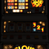
I'm having an issue where some of the layout graphics are really dark and hardly visible in MFME v19.8


For example Emerdale (Mazooma) is great, but the graphics in 'A Knights Tail' are hardly visible, apart from the lit ones,


Is this just normal ?


Thanks

Mark.


#2 FunkyGibbon

FunkyGibbon

    Newbie

  • New Members
  • 4 posts

Posted 23 June 2020 - 05:34 PM

As an example see attached


Mark.

Attached Files

  • Attached File  a.png   1.01MB   1 downloads

Edited by FunkyGibbon, 23 June 2020 - 05:34 PM.


#3 vectra666

vectra666

    No1. Lurker

  • Layout Creator
  • PipPipPipPipPip
  • 9041 posts

Donator

Posted 23 June 2020 - 05:44 PM

whats wrong with the above layout, it looked and looks fine to me, some are made dark some are made too light, it all depends on how the creator see's it when they make them on their set up 


The more I do today, The less I do tomorrow.
Fme is alive and screaming into the 21st century!
Enjoy FME and Happy Gaming!!!!

#4 FunkyGibbon

FunkyGibbon

    Newbie

  • New Members
  • 4 posts

Posted 23 June 2020 - 05:57 PM

Fair enough, was just checking it wasn't a setup error


Thanks

Mark.


#5 wearecity

wearecity

    MFME v whatever the next version number user.

  • Regulars
  • 1672 posts

Posted 24 June 2020 - 09:24 AM

You can have a go at lightening up or darkening a layout.


Open up the layout, press cntl E on the keyboard to go into design mode (or click on design then edit mode).


Then click on design and go to dx lamp creator.


You can then use the slider bars to brighten or dim the layout, the off image/background in particular is a quick way of doing that. Click on update, underneath the slider you've moved for it to apply.


It's always worth checking the layout in attract mode, to see what it now looks like. Sometimes it makes the lamps look horrible and jumpy or make the graininess stand out. In that case, you may wish to try the other sliders to get it looking better.


If you don't like what it's done and can't get it right or back to what it was, simply, close the layout and say no to saving. Of course if you like the change than hit yes.


Sometimes layouts are made dark because the pictures/flyer used are not great quality and/or quite grainy, so the darkness hides some of that.


It could also be done that way, because the layout designer, just wants to create that low light arcade/pub environment and make the lamps really stand out. I remember playing Blue Chip back in the day, in a lot of dark environments.


#6 meme3

meme3

    SocialDragon368

  • Regulars
  • 230 posts

Posted 24 June 2020 - 05:15 PM

You can have a go at lightening up or darkening a layout.


Open up the layout, press cntl E on the keyboard to go into design mode (or click on design then edit mode).


Then click on design and go to dx lamp creator.


You can then use the slider bars to brighten or dim the layout, the off image/background in particular is a quick way of doing that. Click on update, underneath the slider you've moved for it to apply.


It's always worth checking the layout in attract mode, to see what it now looks like. Sometimes it makes the lamps look horrible and jumpy or make the graininess stand out. In that case, you may wish to try the other sliders to get it looking better.


If you don't like what it's done and can't get it right or back to what it was, simply, close the layout and say no to saving. Of course if you like the change than hit yes.


Sometimes layouts are made dark because the pictures/flyer used are not great quality and/or quite grainy, so the darkness hides some of that.


It could also be done that way, because the layout designer, just wants to create that low light arcade/pub environment and make the lamps really stand out. I remember playing Blue Chip back in the day, in a lot of dark environments.

Good way.


#7 FunkyGibbon

FunkyGibbon

    Newbie

  • New Members
  • 4 posts

Posted 25 June 2020 - 07:39 AM

Thanks I'll try that

Mark.


#8 Geddy

Geddy

    Banned

  • Banned
  • 3433 posts

Donator

Posted 25 June 2020 - 12:37 PM

Usually Vecs made dark layouts because he could not be arsed to fix the issues with the base art and rushed the layouts out for the plaudits ;) 


#9 Max Cartwright

Max Cartwright

    Never P off Slasher

  • Regulars
  • 56 posts

Posted 25 June 2020 - 01:13 PM

If you need a great dark layout (  :biglaugh:  :biglaugh:  :SLEEP:  ), then there's a great one here: https://dadsfme.com/...g15072#msg15072 (change great to  :nah: )


https://tagga206.wix...mizemfmemadness

┊┊┊╭╮╭╮┊┊┊┊┊┊┊
┊┊┊┃┃┃┃┊┊┊┊┊┊┊
┊┊┊┃┃┃┃┊┊┊╭ ━━ ╮
┊┊╭┛┗┛┗╮┊╭╯STAY┃
┊┊┃┈▆┈▆┃┊┃SAFE!  ┃
┊┊┃┈┈▅┈┃┊╰┳ ━━ ╯
┊┊┃┈╰┻╯┃━━╯┊┊┊


#10 vectra666

vectra666

    No1. Lurker

  • Layout Creator
  • PipPipPipPipPip
  • 9041 posts

Donator

Posted 25 June 2020 - 01:41 PM

Usually Vecs made dark layouts because he could not be arsed to fix the issues with the base art and rushed the layouts out for the plaudits ;)

Meeeeooow nah they looked dark to the rest as you’re all blind as the three mice and I have 20/20 vision
The more I do today, The less I do tomorrow.
Fme is alive and screaming into the 21st century!
Enjoy FME and Happy Gaming!!!!


1 user(s) are reading this topic

0 members, 1 guests, 0 anonymous users